Animating the background
Animating the background
In this lesson we're going to start bringing some animation to the "Hero Header" section of our landing page. By the end of this lesson, you'll know how to set up and animate the background image, as well as how to make sure the animation looks great.
Getting started
Open the sample code zip file and open folder 00-start. A completed version of this lesson's code is in the folder 01-animated-background.
In this you'll find there's an index.html file, containing some initial HTML to get us started, as well as stylesheets and images folders.
In our HTML we can see references to both the CSS files. I've separated them so that the site's general styling can be used and moved the parts we'll be most interested in for this lesson to the file called header.css.
On prefixes
Just to note, I'll not be including prefixes in the code we write. This means adding -webkit- to properties such as transform and animation. Generally you'll want to put these in place before publishing your work but to keep things readible I won't be showing them during the coding. The downloaded files do include the needed prefixes.
HTML
<body>
  <header>
    <section class="header-content">
      <img src="images/rocky-dashed.svg" class="rocky-dashed">
      <h1 class="header-title">Your awesome landing page</h1>
      <h3 class="header-subtitle">A useful start for your projects</h3>
      <p class="header-button"><a href="#calls-to-action" class="button">Get started today</a></p>
    </section>
  </header>
</body>
This is the main content of our HTML. It's found in index.html. It's fairly simple for now, just a header element containing some content, images, text and headings. We'll be styling and animating this using our CSS.
CSS
Opening our CSS file in stylesheets/header.css we can see the initial styles for the landing page. We have the header, which is set to cover the full height of the viewport. To do this I've used the vh unit. This is expressed as a percentage, so 100vh would mean the entire viewport height.
header {
  align-items: center;
  background: #333;
  display: flex;
  font-size: 18px;
  height: 100vh;
  justify-content: center;
  overflow: hidden;
  perspective: 100px;
  position: relative;
  text-align: center;
  transform-style: preserve-3d;
}

header:after {
  background: #F9FCFF;
  content: "";
  height: 40rem;
  left: -5%;
  position: absolute;
    right: -5%;
    top: 90%;
  transform-origin: 0 0;
  transform: rotateZ(-4deg);
}

.header-title, .header-subtitle {
  color: #fff;
}

.header-subtitle {
  margin-bottom: 5rem;
  text-transform: uppercase;
}

.header-button {
  transform: translateZ(.1px);
  position: relative;
  z-index: 10;
}
Further down the file you'll see the content styling. I've followed a naming convention here where everything starts with header so that we can more easily find the source of this styling should we need to change things later.
Lastly you may have noticed the :after pseudoelement. A pseudoelement is something we can use to add additional content within CSS, for presentational purposes. In this case I'm adding a slanted white box to the bottom of the page to give it a non-square shape and make the overall design more interesting.
To allow for this, I've also set a couple of properties on the header to tell the browser to handle the positioning in 3D. I've set perspective and the transform-style property. This is so that I can push the "header-button" element forward to sit in front of the slanted white box. On small screens, the button would sit behind the box.
Before - how it looks
See the Pen Basic starting HTML for hero header.
Here's what we have to begin. It's a simple layout - hopefully simple enough that it can be tailored for your needs. Let's start with the boring background. We'll get rid of the plain background colour and animate in an image instead.
Let's add a background image
A great resource I often turn to for high quality images is Unsplash. Set up a few years ago as a reaction to the lack of good, free online photography resources, the site now offers a massive range of useful images that you can use in your designs for free. I chose this image for our example header. To prepare it for our use I scaled it down a bit, compressed it with TinyPNG and saved it in the images folder as background.jpg.
We can now add this to our CSS. Opening the header.css file in stylesheets, you'll see there's a header block at the top. In this we've set the background colour to a dark grey. We can remove that.
header {
  align-items: center;

  display: flex;
  font-size: 18px;
  ... etc
}
Now, rather than simply replacing what we removed with a new background property referencing our newly downloaded image, I'm going to do something more interesting.
Animating the background position
We could set a background-position on our background and then animate that, but I don't think that'll be a good idea.
There are two properties that animate very well in the browser. These are opacity and transform. We use the transform for positioning, scaling and rotating elements. Which is great, because browsers can animate these movements smoothly. However this means that if we were to try to animate the background-position property of our new background image, we might see "jankyness", where the animation isn't smooth.
So let's find a way to use transform to animate our background image more smoothly.
Adding a pseudo-element
Since the transform property needs to apply to individual HTML elements, we need to either add a "container" element to our page for the background image, or we can skip that and use a pseudo-element.
I love pseudo-elements. It's a way we can use CSS to create "virtual" elements on our page without adding more markup and can be quite versatile. They can be used for anything from adding extra text to an element, or in this case, adding extra layers of content.
If you look at the content in our header.css, you'll see we already have one pseudo-element, called header:after. This positions a white box at an angle at the bottom of the screen. Let's add another above that:
header:before {

}
Pseudo-elements need a content property, so we'll specify that. We'll also position this element so that it covers the entire header using absolute positioning. We then add the background:
header:before {
  background: linear-gradient(to bottom, rgba(0,0,0,0), rgba(0,0,0,.8)),
              url(../images/background.jpg) no-repeat bottom;
  background-size: cover;
  content: "";
  position: absolute;
    top: 0;
    right: 0;
    bottom: 0;
    left: 0;
  z-index: -1;
}
We're using multiple backgrounds here. By itself the image we've chosen is a bit bright, and text might be difficult to read on top of it. So I've added a linear gradient. Multiple backgrounds always confuse me but they start with the front-most background first, then the second background will appear behind that. If you have it the other way round you might not see your gradient as the background image will be in the way.
Lastly we're setting the background-size to "cover". This tells the browser to crop the image either horizontally or vertically to fill the entire shape. It will lose some of the image but won't stretch it. It's worth experimenting with different settings here, and trying to see if maybe positioning the image in the center or top or bottom looks best.
See the Pen Landing page with background image.
Now we have a background in place, inside it's own pseudo-element container. Let's animate the pseudo-element.
Fading slide down
We'd like this image to fade in, but also slide down. Combining animations like this can make for a nice result and it will allow us to try some timing functions to get a really smooth result.
To begin let's write our keyframes. We set out keyframes like so, with a name, fade-slide-down and in this case a starting and end position.
@keyframes fade-slide-down {
  0% {

  }
  100% {

  }
}
At "0%" we want to tell the browser the background's starting position. It needs to be invisible, and also positioned a little higher. We do this using the transform property with translate.
@keyframes fade-slide-down {
  0% {
    opacity: 0;
    transform: translateY(-4rem);
  }
  100% {
    opacity: 1;
    transform: none;
  }
}
At "100%" we have the ending position. It has an opacity of 1 so that we can see it, and there is no transform. This gives us both vertical movement and a change in opacity.
With the keyframes built, let's apply them to the pseudo-element. Inside the header:before block, add the following line.
animation: fade-slide-down .5s ease-out forwards;
This applies our animation to the pseudo-element. Going from left to right, it first tells it the name of the animation, then the duration of 1/2 a second, the timing function of ease-out and finally the animation-fill-mode.
The last one can be a little tricky but it basically means that the animation should stop on the last keyframe and stay there. In this way the styles in the "100%" keyframe are the styles that will remain once the animation has finished.
Let's see this in action. Press "Rerun" on the CodePen to see the animation again.
See the Pen Landing page with animated background image (.5s).
So the background fades and slides in. That's good. But the animation is a little bit sudden. Let's try to improve it.
First let's try adjusting the duration. UI animations tend to need to happen quite fast, and usually a value of 0.5 seconds is good as a rule of thumb. However for our landing page we'd like the animation to feel a little more luxurious, like it's not in a big hurry.
So let's set the duration to two seconds.
animation: fade-slide-down 2s ease-out forwards;
Here's how it looks.
See the Pen Landing page with animated background image (2s).
That's certainly more relaxed. But it still feels a little stilted. Next, let's look at the timing function.
Custom timing functions
Browsers give us a set of pre-built timing functions to work with. This include ease-in, ease-out and more. They're handy but they tend to be a little bit boring and not always ideal for larger animations. We can instead create our own timing function to change the way our pseudo-element moves on the screen.
What would be better would be if the animation starts a little quicker but then very gradually slows with more of an elongated glide toward the end. It would create a more subtle effect toward the end of the animation, ideally making it less likely to clash with any other animations going on after the background has appeared.
I'm a fan of Cubic-Bezier.com but you can use the built-in inspector tools in Chrome or Firefox to edit your cubic bezier curves.
In this case I'm going to create a kind of extreme variation of ease-in. Moving the starting point to "0,.5" and the ending point to "0,1" it'll start off really fast, but then take it's time toward the end.
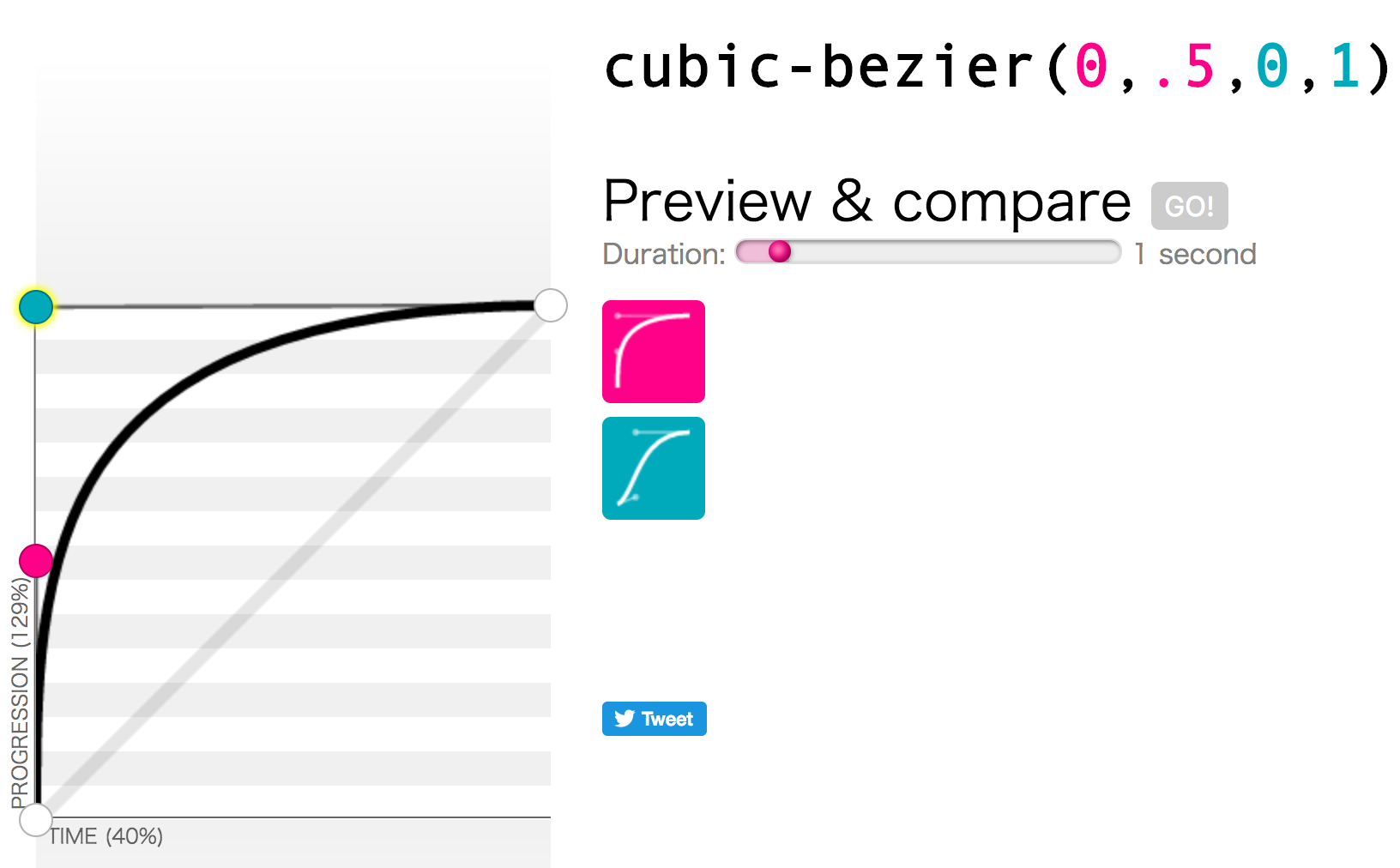
Let's see how that looks in the animation property.
animation: fade-slide-down 2s cubic-bezier(0, 0.5, 0, 1) forwards;
We've taken the 4 numbers output by the website and wrapped it in cubic-bezier() inside our animation property. We can now see it in action.
See the Pen Landing page with animated background image (2s + bezier).
The background now seems to fly in but then slow down gracefully, tapering off to an almost imperceptible finish. That's better.
Not so fast
Before we call this one done, let's think about the timing of when the animation starts. It's a little bit sudden. The page loads and the animation starts immediately. The effect is a little jarring. Let's add some delay. We update our CSS to include a delay of ".5s".
animation: fade-slide-down 2s .5s cubic-bezier(0, 0.5, 0, 1) forwards;
See the Pen Landing page with animated background image (2s + bezier + delay).
Ouch! That's not great. The background is showing, then it disappears when the animation starts. Let's fix that by adding in a starting opacity for the pseudo-element. Our finished CSS for the pseudo-element should now look like this.
header:before {
  animation: fade-slide-down 2s .5s cubic-bezier(0, 0.5, 0, 1) forwards;
  background: linear-gradient(to bottom, rgba(0,0,0,0), rgba(0,0,0,.8)),
              url(../images/background.jpg) no-repeat bottom;
  background-size: cover;
  content: "";
  opacity: 0;
  position: absolute;
    top: 0;
    right: 0;
    bottom: 0;
    left: 0;
  z-index: -1;
}
See the Pen Landing page with animated background image (2s + bezier + delay + opacity).
That's better. The background starts empty, then a moment later fades in while sliding down.
Experiment and find your own style
With timing functions it's always worth experimenting and finding what works for you and the project you're working on. Never stick to the pre-built timing functions!
We'll be using lots of different timing functions as we go through creating the animations on this landing page. It's always worthwhile trying your own and seeing what works for you.
Next: Introducing the titles
In this lesson we've learned about multiple CSS backgrounds as well as how to apply backgrounds and animations to pseudo-elements. We've also seen how tweaking the timing functions on the animation can make a boring animation more interesting. We've also seen how we can apply an animation delay to add better pacing to the way content is revealed.
Next we'll apply some of these ideas of timing and pacing to the content in front of the background image. We'll create and animate the titles and logo.